
Seeing Clearly: How Data Visualization Drives Business Growth
In today's data-driven world, businesses are swimming in information. From sales figures and inventory levels to customer behavior and operational efficiency, the data is there. But raw data, no matter how voluminous, is often just noise without proper interpretation. This is where the art and science of data visualization come into play, transforming complex datasets into clear, actionable insights. At Grassr Solutions, we understand that the ability to quickly grasp what your data is telling you can be the difference between stagnation and strategic growth.

The Pitfall of Poor Visualization: When Data Hides in Plain Sight
Let's consider an example. Imagine you're a retailer looking at sales data for sports equipment over the last few years. You might be presented with a chart like this: a standard clustered column chart showing sales of sports equipment. While it contains data, the key message isn't immediately apparent.

This chart has all the numbers, but it's a busy mix of colors and bars. What's the key takeaway? Are there any clear winners or losers in recent trends? It’s hard to tell at a glance. Decision-makers don't have time to decipher complex visuals; they need information that pops, that guides them to an immediate understanding. This kind of chart often leaves more questions than answers, hindering quick and effective decision-making.
The Power of Clarity: Turning Data into Decisions
Now, let's look at the exact same data presented differently, with a clear focus on communicating a specific insight.
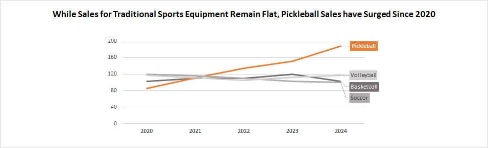
Suddenly, the story is clear: "While sales for traditional sports equipment remain flat, pickleball sales have surged since 2020."
This isn't magic; it's effective data visualization. Here’s why this chart works so well:
Titles are Conclusion, Not Labels: The title itself tells you the main story. You instantly know what the chart is trying to communicate.
Choosing the Right Chart Type: A line chart is perfect for showing trends over time, making it easy to see the strong upward trajectory of Pickleball sales.
Strategic Emphasis: The Pickleball line is highlighted with a distinct color and is directly labeled, drawing your eye immediately to the key data point – the star performer.
Decluttering: The other, less critical equipment categories (Basketball, Volleyball, Soccer) are still present for context but are subtly greyed out. This reduces visual noise and keeps the focus on the main message about Pickleball's growth.
This immediate clarity allows decision-makers to quickly identify growth areas (pickleball gear is booming!) and potential areas for review. This leads to faster, more informed strategies. Perhaps it's time to increase inventory of pickleball paddles and balls, or develop targeted marketing campaigns for this rapidly growing segment. The point is, the insight is immediate, and so is the potential for action.

At Grassr Solutions, we don't just build software to collect your business data; we design systems that help you see it.
Make swift, data-backed decisions that drive real business growth.